OEE IntellSuite
OEE IntelliSuite is a comprehensive software platform designed to help manufacturing companies improve efficiency, productivity, and workforce management. It offers a suite of integrated tools that work with real-world production environments, especially those using Vorne technology for data collection and monitoring.
Project-Website Redesign
3 weeks
UI Redesign and development using - HTML, CSS- Shadcn, JS
©2025 Sharvari Kulkarni. All Rights Reserved.
Project-Work Tracker
4 weeks
UX Design, UI Design, Design System Implementation
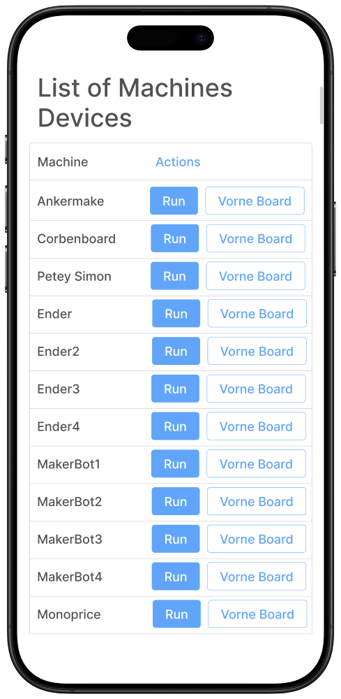
Web-based platform for equipment management and performance tracking
Supports manufacturing environments to improve operational efficiency
Enables easy equipment data entry, editing, and monitoring
Displays real-time operational metrics for informed decision-making
Overview
My Role
Collaborated with the product team to define workflows for the Equipment Entry/Edit Form and Dashboard
Created a scalable design system ensuring consistency, accessibility, and usability
Conducted heuristic evaluations and mapped user flows
Iterated wireframes based on stakeholder feedback
Delivered polished UI design, interactive prototype, and integrated design components for scalability

Redesigned User Interface

Enhanced the user flow by reducing the number of CTAs in a screen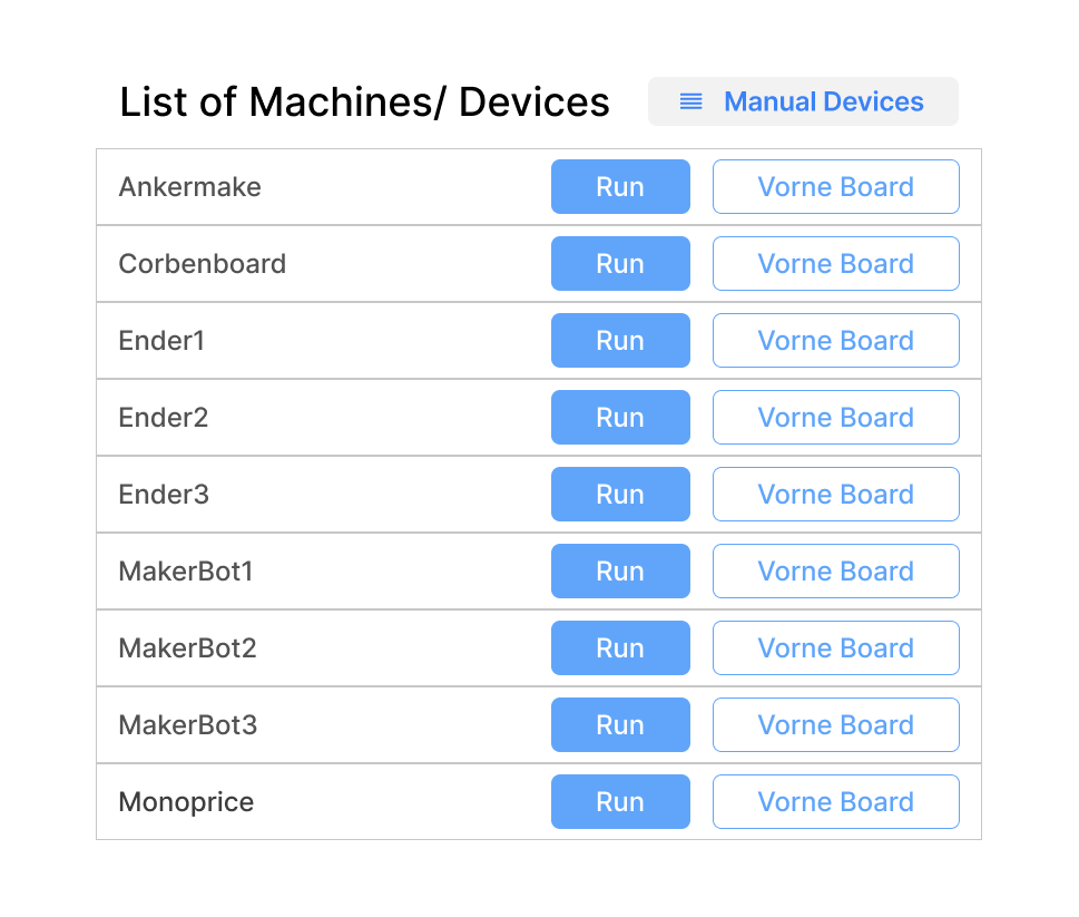
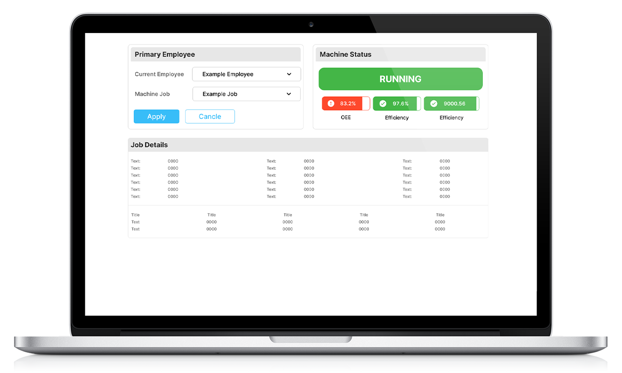
Introduced the design system similar to Metabase improving visual contrast to 4.5:1


Old Layout
Pain Points
Complex data entry process
Cluttered dashboard
Inconsistent design patterns
Limited accessibility support
No clear task prioritization
©2025 Sharvari Kulkarni. All Rights Reserved.
User Research
For the OEE Work Tracker project, I began by examining existing tools in the market such as Limble, MaintainX, and Emaint. My focus was to analyze their user flows, design patterns, and overall usability to understand how maintenance teams interact with such platforms.


Business & Operations
Marketing & Communication
Sales & Customer Service
Creative & Design
Education
Healthcare
Finance
Primary Users
Non-Technical Employees
Manufacturing Worker Insights
-
Current dashboards/monitoring tools are too cluttered; Essential metrics (uptime, defect rate, maintenance alerts) are hard to locate quickly during shift changes.
-
Reveal frustration with inconsistent alert formats:same issue triggers different message styles or severity levels depending on who set it up, causing confusion and missed problems.
-
Operators often ignore minor alerts because of too many false-positives; this leads to alert fatigue, and real problems get ignored.
-
Workers value visual simplicity and want big-picture status (e.g. overall equipment effectiveness) over excessive detail; details are useful but secondary.
-
Need Predictive insights (e.g. when parts are likely to fail) rather than just reporting what has already broken.
Design Needs

Simple

Clear
Accessible

Dashboard Usability Testing
Law of Least Effort – Users prefer the path of least resistance when interacting with interfaces. A minimalistic design with fewer words and clear meaning reduces cognitive load, making it easier for users to navigate and understand.
Hick's Law – The more choices (or information) a user has, the longer it takes to make a decision. Using concise text and focusing on essential elements helps speed up user interactions.
Grice's Maxim of Quantity (from communication theory) applies: provide enough information to be clear but not more than necessary. This principle is crucial in UX writing and minimalistic design.
I applied the laws related to UX design and what makes the user experience flawless. I worked with some usability test with my peers to get their reviews and feedbacks about my design process.
Here’s what stood out
Users needed a straightforward and intuitive workflow with minimal learning curve.
Navigation had to be simple, with clearly visible and distinguishable CTAs to encourage easy interaction.
The visual hierarchy should guide users naturally through the process of adding or editing work timings.
A clean and uncluttered UI was critical to reduce cognitive load for non-tech-savvy employees.
Learnings
During this project, I experienced what it was like to balance out the user's expectations while also keeping in mind the business goals.
Balancing User Experience VS Business Goals
Designing Holistic Experiences for users
Working with a real-world client allowed me to experience what it was like to design holistic experiences for users.
First Experience with Ecommerce Design
This project was my first experience with E-commerce design, and I was able to gain first-hand experience with what it was like designing beyond the constraints of a single product.
Discover responsive UI designs and internship work with AI.